在ios5之前,我们如果要实现fixed导航条,我们得依赖iscroll来支持。
不过从ios5.1以来,fixed定位就已经支持了,但很遗憾,ios现在对它还只是半支持。
在大部分情况下,fixed表现得没有什么问题。
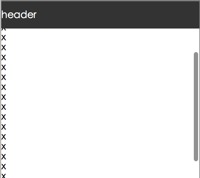
但是在某些情况下,会出现一些比较奇葩的问题,比如fixed元素中存在输入框子元素,这个时候就会跪了。
可以看到,fixed定位的元素跑到中间去了,这种问题一般出现在页面有scrollTop并且输入框获得了焦点的情况下!
Note: 应该是由软键盘引起的问题。
怎么解决这种问题呢?我目前知道的主要有三种办法,假设HTML代码结构为:
1
2
3
4
5
6
7
8
9
10
11
12
13
14
15
16
17
| <!DOCTYPE html>
<html>
<head>
<meta charset="utf-8" />
<meta name="viewport" content="width=device-width, initial-scale=1, maximum-scale=1, user-scalable=no">
<title>fixed</title>
<style>
header {
position: fixed;
}
</style>
</head>
<body>
<header><input type="search" placeholder="请输入搜索词" /></header>
<div id="container"></div>
</body>
</html>
|
方法一
在输入框获得焦点时,将fixed改成absolute,并将top值设置为页面此时的scrollTop,然后在输入框失去焦点时,改回fixed。
1
2
3
4
5
6
7
8
| function onFocus(e) {
this.main.style.position = 'absolute';
this.main.style.top = document.body.scrollTop + 'px';
}
function onBlur(e) {
this.main.style.position = 'fixed';
this.main.style.top = 0;
}
|
此外我们还得做一些额外的处理,比如禁止页面滚动,为啥要禁止滚动?
因为软键盘弹起的时候,用户还是可以滚动页面的,一旦用户往下滚动了页面,header也随着往下滚动了(因为此时它是absolute的)。
1
2
3
4
5
6
7
8
9
10
11
12
13
14
| function onTouchMove(e) {
e.preventDefault();
e.stopPropagation();
};
function onFocus(e) {
this.main.style.position = 'absolute';
this.main.style.top = document.body.scrollTop + 'px';
document.body.addEventListener('touchmove', onTouchMove, false);
}
function onBlur(e) {
this.main.style.position = 'fixed';
this.main.style.top = 0;
document.body.removeEventListener('touchmove', onTouchMove);
}
|
这种方法基本能解决大部分需求,但是在输入框有搜索提示的时候也会挂,因为我们禁止了滚动,而搜索提示通常应该要能往下滚动。
方法二
在输入框的touchstart事件发生时,将fixed元素改成static,然后再将焦点focus到输入框中,然后输入框blur时,再将其设置成fixed:
1
2
3
4
5
6
7
8
| input.addEventListener('touchstart', function(e) {
main.style.position = 'static';
input.focus();
e.preventDefault();
}, false);
input.addEventListener('blur', function(e) {
main.style.position = 'fixed';
}, false);
|
这种方案的原理就是先将fixed元素改成static,这样该元素就会回到页面顶部(正常流),
然后调用输入框的focus方法,将焦点移到输入框中,此时页面视角也会跳到顶部。
Note: 优酷无线首页现在就是这么做的。
方法三
这种方案是将header和container都设置成absolute,然后只滚动container。
这种的方法主要依赖ios5.1以后提供的-webkit-overflow-scrollingcss属性。
HTML代码结构:
1
2
3
4
5
6
7
8
9
10
11
12
13
14
15
16
17
18
19
20
21
22
23
24
25
26
27
28
| <!DOCTYPE html>
<html>
<head>
<meta charset="utf-8" />
<meta name="viewport" content="width=device-width, initial-scale=1, maximum-scale=1, user-scalable=no">
<title>fixed</title>
<style>
header {
position: aboluste;
height: 45px;
width: 100%;
}
#container {
position: absolute;
top: 45px;
bottom: 0;
width: 100%;
overflow: auto;
-webkit-overflow-scrolling: touch; }
</style>
</head>
<body>
<header><input type="search" placeholder="请输入搜索词" /></header>
<div id="container">
...
</div>
</body>
</html>
|
这种方案也有坑,主要表现在:当软键盘弹起时,用户一旦滚动界面,整个文档都会滚动(包括header、container),fixed的效果就没有了。
还有一个更深的坑就是,在软键盘弹起的时候,往上滚动页面,header此时也会随着往上滚,
然后收起软键盘,container居然滚动不了(手指多移动几次后,才能正常滚动)。
Note: 这个问题不知道什么原因,以后有发现再更新本文。
综上,我还是喜欢使用第二种方案。
参考文章
